My influence on the project at a glance
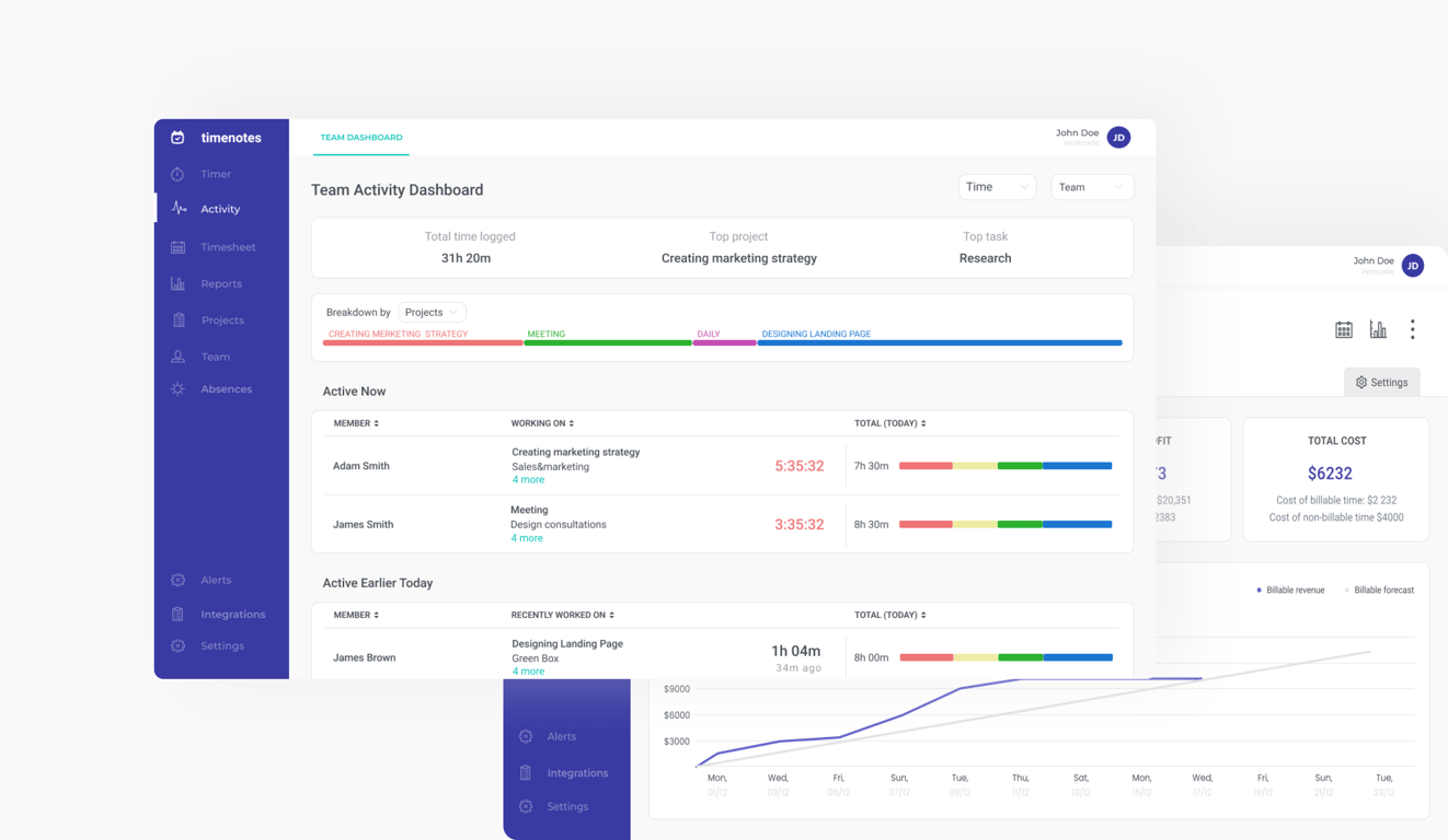
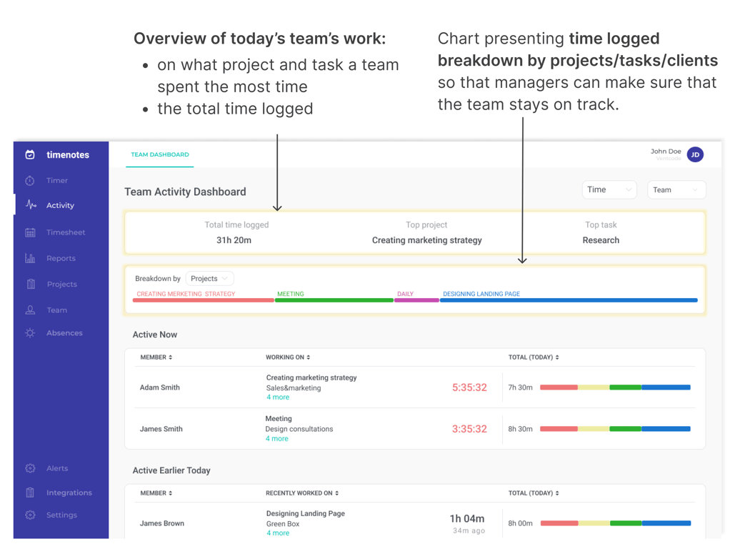
During my collaboration with Timenotes, I redesigned key parts of the app and created a new Team Activity Dashboard to solve a critical pain point: managers had no quick way to see what their teams were working on in real time. I translated users insights into a dashboard that reduced the need for constant check-ins and made prioritization faster. As a result, managers could instantly spot who was inactive, what tasks were in progress, and whether teams were focusing on priorities — significantly improving efficiency and strengthening Timenotes’ value against competitors.
Context
Timenotes is a web-based time tracking application that allows companies all over the world to report and manage employees’ working time efficiently and effortlessly.
How does it work? During the working day, employees use a time tracker or add time logs after completing work to report on what they worked on. Each time log is assigned to a task and can include additional details such as tags, description, billable status. Timenotes enables creating e.g. reports both for clients’ and employees' billings, managing absences and it integrates with tools such as Trello, Asana, Todoist and more.
👇 Click to jump to the corresponding section
Designing new feature: Team Activity Dashboard
Appendix: Redesign of other Timenotes sections
Designing new feature: Team Activity Dashboard
Problem
Owners and managers of the companies do not have possibility to make sure that the employees are working on the right tasks at the moment. There was a clear need for a daily overview of time distribution—who is working on what, for how long, and who is inactive. Timenotes didn’t address this, creating a gap in managerial oversight.
‘We have to ask each person: what are you doing and why? It’s a waste of time.’ - Timenotes user
Main challenges
- Huge amount of information that could potentially be displayed on this kind of dashboard.
- Fast pace at work of supervisors makes prioritization and presentation of information included in the dashboard extremely important.
- Selecting information that is crucial for managers and presenting them in a transparent way that will make managers’ decision-making process quick and easy.
UX Research
Initial insights: in the continuous process of talking with current Timenotes users and getting their feedback, we discovered a need that Timenotes was not covering. Owners of the organizations and managers needed to know what the team is doing at the moment, without asking everyone on Slack or checking files. It turned out that the current reports’ section was not enough because it didn’t present the trackers that were currently going and they couldn’t quickly access the data that they needed while performing their daily work.
Interviews
In order to understand users and their needs more deeply, we decided to gather qualitative data via in-depth interviews with current Timenotes users. I was responsible for recruiting participants and personally reached out via email to customers who had either requested support or specifically asked for this feature. This ensured allowed us to organize interviews quickly and gather insights directly from those experiencing the most relevant challenges. To make these sessions valuable, I prepared a structured interview script that balanced open-ended exploration with targeted questions.
Before drafting the script, I clarified the research objectives:
- uncover how managers currently track what their teams are doing,
- identify the information they lack in their daily decision-making,
- and understand the pain points of existing workflows.
I also piloted the script internally to refine clarity and ensure that questions encouraged storytelling rather than yes/no answers.
Examples of questions included:
- “How do you usually find out what your team is working on, and what actions do you take based on that information?”
- “What information about your team do you need in your daily work to feel in control?”
- “Can you describe a recent moment when you lacked visibility into your team’s work? What happened, and how did you solve it?”
IDI results
- Information about previous time logs of employees and the length of the current time log influence actions that managers take
- Ability to quickly localize a member or a group is crucial
- Status of tasks (whether it’s finished or still in progress) makes a significant difference for managers
- To stay on track managers need synthesized information about the time distribution
Competitive Audit
The competitive analysis of other time tracking software activity dashboard allowed us to identify any elements users are used to and perceive as ‘industry standards’ (the majority of the users migrate from other tools). The carried-out analysis allowed us to compare different approaches towards this section.
Desk Research
Desk research included reviewing existing data, such as internal team knowledge, industry articles, users’ requests and questions concerning the need that were sent to the support.
💡 Main UX research insights
- Main objective: the dashboard should focus on employees and their work
- Only necessary and needed information should be included, more advanced insights are needed rarely and can be accessed via the reports section
- It is important to quickly find out who is not working today and why
- Managers need to see tasks’ status (finished or still in progress), and the history of time logs
- Admins need to be able to specify who can access this section
- To stay on track managers need synthesized information about time distribution
Low fidelity wireframes
Based on the research conducted earlier I prepared sketches that I finally transformed into low-fidelity wireframes in Figma that demonstrated the capabilities of the section. After getting feedback and discussing them during critique sessions, wireframes were iterated.
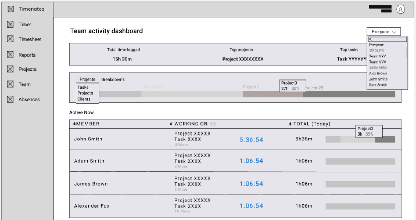
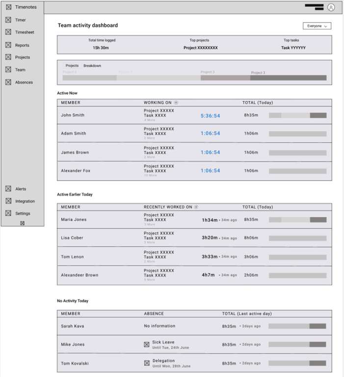
Addressed user needs and high-fidelity wireframes
Below you can find prepared high-fidelity mock-ups along with solutions designed based on identified users needs.
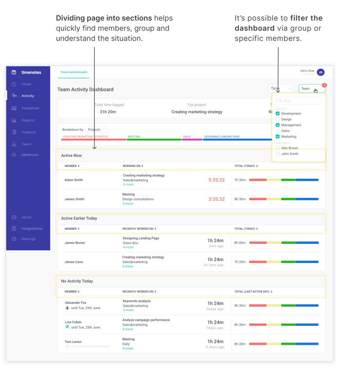
Identified user need: be sure that the team works today on priorities
👇 Designed solutions addressing the need 👇
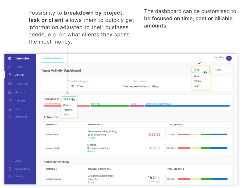
Identified user need: be sure that a given employee is working on the right tasks
👇 Designed solutions addressing the need 👇
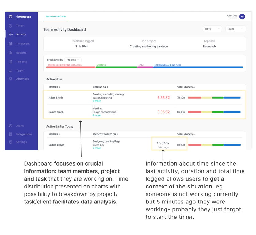
Identified user need: quickly get insights about a specific employee or a given group
👇 Designed solutions addressing the need 👇
Results
‘Much better than the dashboard from the other software. I most appreciate possibility of seeing at first glance, on the chart on what projects my team is working today and then being able to break it into tasks if I need more information’ - Timenotes user
‘It’s super useful for my team’ - Timenotes user
The aim of creating the team activity dashboard was to provide current and future managers and owners of organizations with a place in Timenotes where they can access information needed during their everyday work quickly and easily, avoiding information overload and confusion.
As a result of the UX and UI design and development processes, we managed to implement an additional but complementary section in Timenotes that meets users' needs and makes Timenotes as a product even more competitive on the market.
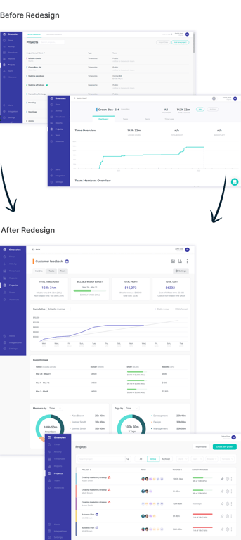
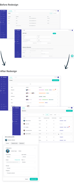
Appendix: Redesign of other Timenotes sections
Redesign stages
📉 The process of redesigning Timenotes started with defining, setting, and reviewing UX and metrics which enabled a better understanding of the product, its pain points and users’ actions. Setting additional metrics was also necessary for measuring the success or the failure of the planned redesign.
Redesigning any section was preceded by comprehensive UX research including competitor analysis, desk research, and users interviews. Based on the gathered data, I was able to identify users’ pain points, needs, shortcomings in the current Timenotes version, and some industry standards of the offered functionalities. After identifying problems and needs, I looked for solutions and transformed them into low-fidelity wireframes. After reviewing low-fidelity wireframes, I created high-fidelity wireframes based on the UI design system. Despite using the design system, my work often included designing UI custom elements.
💡 Main changes in the redesigned projects section
- New structure of project dashboard presenting information in a prioritized and transparent way
- Possibility to pin projects on the list and sort by project’s status
- Creating new projects based on template
- Bulk edit including archiving and deleting projects
 Made with Bullet